
Have you ever walked into a room and felt that everything just clicked—the walls, the furniture, the atmosphere? That’s the magic of coordinating paint colors with furniture. It’s not just about picking shades that look nice together; it’s about shaping how a space makes you feel and function. The wrong combination can throw off the balance of a room, making it feel cramped, dull, or disconnected. But when color and furniture align, the result is a breathtaking harmony that enhances comfort, personality, and flow in modern interiors.
How to coordinate paint colors with furniture?
Coordinating paint colors with furniture starts with observation — take a close look at the dominant tones and materials in your space. Whether your pieces are grey linen sofas, beige wooden tables, or sleek black metal frames, these existing colors will guide your choices for walls and accents. Once you’ve identified the furniture palette, it’s time to plan the proportions and pairings strategically.
What is the 60-30-10 rule?
This rule provides an easy framework for color balance. Around 60% of your room’s color should come from the walls — that’s your base shade such as light grey, white, or soft cream. 30% belongs to secondary colors, typically large furniture or an accent wall in tones like beige or taupe. The remaining 10% is for accents — think cushions, artwork, or vases in bold shades like olive green or navy blue. This mix keeps your space lively yet cohesive.
How do you pick a base color?
Start with neutrals for flexibility and balance. Grey, white, or beige make excellent foundations because they complement most furniture materials. For instance, a light grey wall enhances black leather seating with a crisp, modern feel, while warm white subtly flatters light wood tones. If your furniture already makes a statement — for example, a navy velvet sofa — a soft beige or off-white wall helps it shine without overwhelming the space.
What about color wheel use?
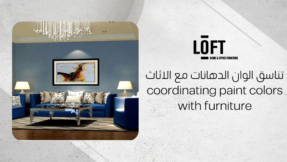
The color wheel is your best friend when refining combinations, especially when coordinating paint colors with furniture. Analogous colors—such as blue and grey—create a calm, seamless flow; for instance, pairing charcoal walls with blue-toned furniture feels harmonious and sophisticated. In contrast, complementary colors (those opposite each other on the wheel) introduce energy and contrast. A grey wall scheme accented with soft, dusky yellow in furniture or décor adds warmth and vibrancy without clashing, demonstrating how thoughtful coordinating paint colors with furniture elevates the entire space.
How do lighting and space matter?
- Use lighter paint shades in small rooms to reflect light and make them appear more spacious.
- Try deeper hues in larger rooms to add depth and coziness.
- Always test paint samples beside your actual furniture and fabrics before painting.
- Observe how colors shift under morning sunlight and evening lamps — natural and artificial lighting can dramatically alter tone perception.
Also, align your choices with the room’s function. A living area benefits from warm, inviting hues, while bedrooms feel more serene with gentle neutrals. When you see how paint, furniture, and light work together, coordination becomes as intuitive as it is beautiful.
What role do neutral colors play?
Neutral paint colors such as grey, ivory, beige, and white form a calm, versatile foundation—making them ideal when coordinating paint colors with furniture. These shades visually expand rooms, creating a bright, airy feel that helps even compact spaces appear open and inviting. Acting as a quiet backdrop, neutral walls allow bolder furniture tones or statement accessories to stand out, giving you flexibility to refresh the look without committing to a full repaint. Because they never overwhelm the senses, neutrals let light, texture, and the finer details of your furniture and décor take center stage.
Why use greys and beiges?
Greys and beiges bring effortless balance and warmth to contemporary settings. Their understated beauty enhances both minimalist and modern aesthetics, complementing materials like wool, metal, or glass without clashing. These hues also create harmony between furniture finishes, helping different textures blend naturally into a cohesive style. The result is an adaptable foundation that makes coordinating paint colors with furniture far more intuitive.
How do neutrals help transition?
Neutral shades make transitions between furniture styles and spaces feel smooth and consistent. For instance, a soft grey living room wall can link seamlessly with a beige-toned hallway or a crisp white kitchen, maintaining continuity while allowing each area to retain its personality. Similarly, when you introduce a statement armchair in teal or a rug with bold geometry, the neutral backdrop keeps the look balanced rather than chaotic. This flexibility is why neutrals remain the go‑to choice for anyone who enjoys evolving their décor without starting from scratch.
How to link paint color with specific furniture materials?
When it comes to coordinating paint colors with furniture, the material’s texture and finish can completely shift how a hue is perceived. A soft wool sofa with its matte, cozy texture absorbs light differently than a sleek leather armchair or a glossy varnished wood table. Warm, natural materials—think wool, linen, or oak—tend to harmonize beautifully with earthy paint tones such as clay, sand, or muted taupe.
In contrast, furniture with reflective surfaces or synthetic fibers, such as lacquered metal, glass, or polished leather, works best with cooler or more contemporary shades. Gentle grays, icy blues, and clean whites enhance these materials’ shine and keep the overall look balanced rather than overwhelming.
What to do with wool/viscose rugs?
Rugs often act as the anchoring element that links your wall color with your furniture tone. Wool rugs, known for their warmth and texture, invite colors from the warm spectrum—beige, terracotta, or honeyed neutrals—to maintain a grounded, inviting look. On the other hand, viscose rugs, which have a subtle sheen, suit cooler, lighter palettes like misty gray or powder blue, emphasizing their elegant surface play.
When working with rugs that combine wool and viscose, it’s best to keep wall tones neutral—an approach that works especially well when coordinating paint colors with furniture. Shades like cream, soft greige, or feather white allow the rug’s rich texture and material contrast to stand out without visually crowding the space. Before committing to a color, always test paint swatches beside key furniture pieces and at different rug corners under both natural and artificial light. This ensures your chosen wall tone truly supports the furniture, flooring, and rug materials in a balanced, cohesive way.
How to handle bold accessories?
- Choose one or two strong accent colors and repeat them through cushions, throws, or poufs for visual continuity.
- Keep the surrounding wall and furniture palette calm so these accents pop instead of clash.
- Use textured accessories—woven baskets, knitted throws—to bring layered warmth without over-coloring the room.
- If you love bright tones but fear commitment, test them in removable décor first, such as pillow covers or small artwork.
- Always step back and observe: do the bold items complement your main palette, or are they competing? Adjust tones accordingly to keep balance intact.
What are the best Loft Furniture products for color coordination?
Loft Furniture offers a curated collection of pieces thoughtfully designed to simplify the art of coordinating paint colors with furniture. Each item is crafted with neutral tones, subtle textures, and balanced proportions—making it easy to blend seamlessly with various wall shades, materials, and décor styles.
Dimaggio Carpet
The Dimaggio Carpet (200x300 cm) from Carpets section delivers understated elegance with its soft grey finish, woven from a blend of wool and viscose. The geometric patterns add a sense of depth, while the gentle sheen from viscose introduces a refined contrast that enhances both cool and warm palettes. Its medium pile height ensures softness underfoot without compromising practicality—perfect for daily living.
This carpet harmonizes beautifully with minimal, modern, or Scandinavian interiors, pairing effortlessly with light wood accents, soft greys, bold blacks, or crisp whites. It’s the kind of foundational piece that ties the room together while maintaining a calming visual flow.
Eiru Pouf Square
Compact yet full of texture, the Eiru Pouf Square (40x40x40 cm) comes in an ivory fabric that feels both soft and structured. Its raised stripe texture adds a tactile layer to the space, making it a subtle statement piece that complements a wide range of modern, eclectic, or cozy interiors.
Because of its neutral hue, this pouf easily supports diverse paint choices—whether pastel walls, warm neutrals, or bold accent colors. Lightweight and versatile, it serves as a footrest, accent seat, or decorative layer, bringing functional charm and visual warmth to any setting.
What practical steps guarantee color harmony?
When coordinating paint colors with furniture, a few thoughtful steps can transform how a room feels and flows. Here’s a practical roadmap to help you achieve color harmony effortlessly.
- Assess existing furniture and finishes.
Begin by identifying the dominant hues and finishes of your large furniture pieces, floors, and accent décor. These elements will guide your paint selection, ensuring that nothing clashes once the walls are done.
- Use a color wheel to your advantage.
Whether you prefer a printed or digital version, a color wheel is your best friend. Use it to explore harmonious pairings, such as analogous colors for a calm effect or complementary hues for bold contrast.
- Collect and compare paint swatches.
Hold color swatches next to your sofa, rugs, and fabrics under both daylight and evening lighting. This simple step helps you see how colors behave in different conditions before making any permanent decisions.
- Factor in the room’s size and function.
The mood of a space changes with both its purpose and dimensions. Light neutrals often make smaller rooms feel open and airy, while deeper tones can ground larger spaces with warmth and character.
- Test samples directly on the wall.
Paint small test areas beside your main furniture or textile pieces. Observe the color over a couple of days to notice how it shifts from morning to night, then tweak your choices if something feels off.
- Create flow between rooms.
A sense of cohesion comes from repeating one or two dominant colors—either from the walls or furniture—in adjoining spaces. This repetition subtly ties the whole home together without feeling repetitive.
- Add personality through accessories.
Once the base colors are in place, express individuality with accent pillows, poufs, or throws. Switching these out seasonally or when trends change lets you refresh your décor without repainting.
How to analyze existing colors?
- Look at the key furniture items first; sofas, cabinets, and rugs usually set the tone.
- Note undertones—does your beige lean warm like cream or cool like gray?
- Compare wood finishes; their shades influence the overall palette.
- Observe accent décor pieces such as artwork or vases for secondary color cues.
How to test paint samples?
- Paint two or three small patches on different walls to see variations in light.
- Let each sample dry completely before judging the color.
- Check the colors at various times of day, from morning sunlight to evening lamps.
- Move furniture near the samples to see how the hues respond to textures and tones.
- Make final adjustments only after a full day’s observation.
What about coordinating room-to-room?
Color harmony doesn’t stop at one room—it continues throughout the home. Repeating subtle elements like a wall tone, fabric shade, or wood finish connects spaces naturally, creating an inviting rhythm as you move between areas.
Tips:
- Use a lighter or darker variation of the same hue to link rooms seamlessly.
- Carry a consistent neutral backdrop and change only accent tones for variety.
- Echo one material or texture, such as a brass finish or woven fabric, across spaces.
- Maintain a unified undertone across all colors for a cohesive, balanced feel.
FAQs about coordinating paint colors with furniture
How do neutral colors make a room feel bigger?
Neutral shades like white, ivory, or pale grey reflect more light, which instantly opens up a space. They create an airy, spacious feeling by bouncing light around the room and reducing visual heaviness.
Is it okay to use bold wall color with neutral furniture?
Yes—bold wall colors can absolutely work with neutral furniture. The key is balance: keep accessories minimal and coordinate the undertones of your walls and furniture to maintain harmony and visual cohesion.
How should I coordinate paint color with patterned rugs?
When working with patterned rugs, choose neutral or subtle wall colors so the room doesn’t feel too busy. This approach lets the rug remain the focal point and prevents any clash between patterns and wall tones.
Conclusion
By following structured and practical techniques for coordinating paint colors with furniture, you all can create interiors that feel cohesive, balanced, and effortlessly stylish. A thoughtful approach to color harmony allows every piece to complement the space, ensuring your home remains adaptable and visually pleasing no matter the style or mood you wish to express.